| Colorants & dyes Coloring, dyeing and devil's colors Choosing the color of one's garments in Middle Ages before the advent of synthetic dyes, was more a question of money than a question of taste. Unlike other rare and expensive colors such as purpur, blue color was readily available. The most important blue dye was the indian indigo or the somewhat less intense and locally available woad. Manufacture of the dye involved fermenting the woad leaves with human urine. The fermentation is facilitated by the presence of alkohol in the mixture. The usual method for the dyers was to drink alkohol and use their alkohol enriched urine for the fermentation process. Pieces of fabric were immersed in the woad bath usually on sundays for at least 12 hours. The blue color became visible after a prolonged contact of the fabric with air. Drunken dyers lying around hanging fabric on mondays gave rise to colloquial german expressions such as "Blauer Montag" (blue monday = stay away from work on monday) and "Blau werden" (get blue = get drunk). Vasco de Gama found a maritime route to Indiain 1498 and brought indigo to Europe. Dyeing with indian indigo was prohibited by law, partly under death penalty, to protect local peasants from foreign competition. German King pronounced indigo in 1654 "devil's color". At the end of the 17th century Elector Friedrich Wilhelm introduced blue uniforms in the prussian military service to further support the peasants. The blue color of the uniforms was also supposed to give serious and orderly impression. The blue of german uniforms was abandoned in WW1 in favour of camouflage colors. The indian indigo prevailed slowly over woad based on its better dyeing properties and was finally legalized in 1737 and the "Devil's Color" became the "King of the Dyes". Red was the color of Nobility during Middle Ages while the dull blue of woad was the color of servants and lower ranks. The shining blue garments dyed with imported indian indigo were initially reserved for French Royals, later it was also used for working clothes. Blue jeans, originally the attire of gold diggers in California are dyed with indigo up to the present days. Finally in 1897 Adolf Bayer discovered and patented a method to produce indigo synthetically. |
|
Wednesday, February 11, 2009
COLORANTS & DYES
BLUE IN THE EGYPT
| Ancient Egypt The blue mineral Lapis Lazuli possessed purportedly life-giving powers. The Book of the Dead describes Horus, the hawk-like son of the God Osiris destroying all evil. After his deed he appears in the heavenly firmament in the form of a hawk and "his torso is made of blue stone". Egyptian Blue (blue frit) was used in conjunction with lapis lazuli for painting eyes, hair and crowns of the pharaos' statues and sarcophags. Nile, the most important river of ancient Egypt, is rendered in blue color on grave paintings. Blue colored hippopotamuses produced by artisans were popular as symbols for the life-giving river. Nude female figures coated with blue glaze found in egyptian graves might have represented life and Creation. Intensely blue images of Heaven carrying yellow stars shine from the ceilings of egyptian temples. Blue is the color of the Universe, of the movement of the Sun and the Stars in the firmament merging into the Ocean at the edges of the painting. Blue is also the background color of the paintings depicting the royal graves in the Valley of the Kings. Head kerchiefs of the Kings and their insignia are painted in blue and gold. Jewelry of Tutankhamen was made of gold and lapis lazuli. Pharaos were considered sons of the Sun-God Ra, the highest deity of the Egyptians, who 's color was gold. Gold as well as blue were both divine colors and the famous mask of Tutankhamen was made of 22 carat gold. Egyptians saw Life in the deep blue color of water and the Divine in the immense blue of the sky, thus the dawn of the symbolism of the color blue lies in Ancient Egypt (see Egyptian Hymn of the Sun). The color blue, however, precedes all Empires: Skies and Oceans were blue before the dawn of Man on Earth. The cause of the blue color of the sky is dispersion of white light on molecules of air (Ralyleigh scattering), the dispersion being strongly dependent on the wavelength of light ( shorter wavelength of blue light are dispersed the strongest). The first color consciously perceived by Man in Stone Age was, however, not blue but red. It is conceivable that the ability to discern blue and green from other colors was not developed until much later stages of the human history. |
|


INTRODUCTION TO THE BLUES
| Introduction Blue is the color of sky and water. The blue of water - the color of depth - impersonates the female principle. Blue of the skies used to be associated with the male principle. It is the color of all heavenly gods and stands for distance, for the divine, for the spiritual (voiced particularly by W. Kandinsky). This interpretation goes back to ancient Egyptians and was taken on by later cultures. Skin of Egyptian god Amun was rendered blue. The blue color in Mary's's mantle in "The Annunciation" by an unknown master links Heaven and Earth, proximity and distance and also the Divine and the Mundane. Archangel Gabriel brings the tidings of the conception, the Blue of Mary's mantle can be seen in this context as a symbol of purity. Blue has remained the symbol of fidelity till our times, as fidelity can be proven only from distance, where the opportunity for unfaithfulness awaits. Blue flowers, such as forget-me-nots and violets symbolize faithfulness. According to an old english custom, the bride wears blue ribbons in her wedding gown and a blue saphire in her wedding ring. Tiny flowers of blue speedwell are part of the wedding bouquet . |
|

| Effects of the color BlueBlue invokes dreamlike states, it instills yearnings and has a calming effect, it leads to a serious inward outlook. Yves Klein's monochrome paintings can be seen along the same lines. Blue is the color of the heart and has a positive connotation. Unpleasant things of life, such as parking tickets, train tickets or the "blue letters" ("blaue Briefe" in German) announcing dismissal from work or not passing to the next grade in school are colored blue so they are accepted more readily. Blue and red are the favourite colors of the Germans, which (together with its positive connotation) explains the frequent use of blue color in advertising. Blue color suggests cleanliness and freshness in household products such as detergents, blue drinks are cool and light. The Blue Flower of Romanticism The blue flower was a popular motif of Romantic poetry. The hero of Novalis' fragmentary novel "Heinrich von Ofterdingen" (1802) dreams of a blue flower instilling momentuous yearning in his soul. Novalis' poetic symbolism of the color blue is perceived by the reader intuitively: thinking of the color blue brings about a dreamlike yearning and produces both a feeling of calmness and of security. |
A HISTORY OF COLORS
A History of Colors
![]()
MODERN / MINERAL
Artists have painted images of the natural and supernatural worlds for more than 30,000 years. For their materials, prehistoric painters reached into the earth. Compounds of iron oxides yield muted colors of red, yellow and brown. Carbon makes a strong black with a bluish tinge, while bone black makes a warmer color. Calcium carbonate (marble dust) is easy to find and make into a pigment. Until the Industrial Revolution, the majority of colors on artists' palettes were lightfast earth colors, which is why the Old Masters' paintings are mostly brown.
During the Industrial Revolution, oil colors were from inorganic pigments that are compounds of minerals, such as cobalt, cadmium, and manganese. These are the mineral colors, and they were developed for every hue on the color wheel. Their intense mass tones complemented earth colors on painters' palettes and replaced paints made from expensive semiprecious stones, fugitive colors, or highly toxic compounds.
Impressionism would have been impossible without this full spectrum of pigments packaged for the first time as oil colors in tubes. While intense in their mass tones, mineral colors grey down when mixed with white. This attribute makes them particularly valuable for painting natural light (landscape, portraiture and still life) because most colors of the natural world have a strong element of grey. Mineral colors are also the most opaque artists' colors.
Modern colors are very similar in masstone to the mineral colors. ("Masstone" refers to the oil color as it comes from the tube.) However modern colors and mineral colors behave differently when mixed with mediums, mixed with white (tinted), or mixed with other colors to produce secondaries. Modern colors are noted for their intense tinting strength and transparency. Most important, they do not grey down when mixed with white.
Innovation in color chemistry throughout the 20th century has presented painters with another full spectrum of colors of modern organic pigments. These pigments are called organic because they are made from chemical compounds with a central carbon atom. They are primarily made for commercial printing, plastics, and auto paints. Among thousands of new colorants made in the twentieth century, only a few, including phthalo, hansa and quinacridone, are lightfast enough to be used in artists' colors. These pigments we call the "modern colors."
Unfortunately, many modern colors were introduced as "hues" or replacements for more expensive mineral colors such as cadmium and cobalt. But the modern colors have their own characteristics. These become obvious when they are thinned or mixed with white or other colors. Unlike the mineral colors, modern colors produce high key colors in masstone, transparency and tint. While their characteristics offer painters more color possibilities, modern colors can disappoint those who use them for natural light effects because they do not grey down.
Mineral colors
Many inorganic pigments are made by heating compounds such as cobalt and aluminum to temperatures more than 2,000 degrees F for long periods of time. High priced raw materials plus the high costs of manufacturing make cobalt and cadmium colors particularly expensive. Colors from a family of mineral pigments shift from light (Cadmium Yellow Light) to dark (Cadmium Yellow Deep).
They grey down when mixed with white which is perfect for capturing light of the natural world. Mineral based pigments have larger pigment sizes and lower tinting strengths than modern colors. They are leaner and naturally more matte. Mineral colors are mostly opaque. Ultramarine Blue and Viridian are exceptions; these are semi-transparent. Most mineral colors have excellent lightfastness rating (I).
Modern colors
Modern organic pigments are made in high tech factories from molecular materials which have central atoms of carbon. Most modern colors, including quinacridone, pthalo and perylene are transparent. Hansa and napthol are semi-transparent. Because of their small particle sizes and higher oil absorption (fatter), modern pigments make colors of very high tinting strength that are naturally more glossy.
When mixed with white, modern colors make incredibly intense tints. They stay high key in mixtures unless a complement is added. Rather than shift colors from light to dark, a family of modern colors shifts from warm (Phthalo Green Yellow Shade) to cool (Phthalo Green). Some modern colors have excellent lightfastness ratings (I) and some have very good lightfastness ratings (II). Tubes of artists' grade colors are marked with a lightfastness rating.
Here are some valuable pairings of mineral and modern colors to explore:
To boost: Add:
Cadmium Yellows Hansa yellows
Cadmium Orange Mono Orange
Cadmium Reds Napthol Reds
Cobalt Violet & Manganese Violet Dioxazine Purple
Cobalt Blue & Ultramarine Blue Phthalo Blue
Viridian & Cobalt Green Phthalo Green
Alizarin Crimson Quinacridone Red / Magenta
![]()
WHITE
Titanium White is made from titanium dioxide which was first discovered in the late 18th century. High quality, pure titanium dioxide reflects 97.2% of incident light. It is the most brilliant of the white pigments. Titanium White is non toxic and less prone to yellowing and cracking than Lead White (especially when a small amount of zinc oxide is added to the formula).
Zinc White is made from zinc oxide. As early as 1785, painters were using Zinc White instead of Lead White. Compared to all other whites, Zinc White has less hiding power. It dries more slowly so painters who want to paint wet into wet over a long time will find it useful. Zinc White is the coolest white. It has a slightly bluish cast. Being more transparent than other whites, Zinc is good for glazing and scumbling. Its creamy texture makes it a great choice when using impasto techniques or for making paintings in one sitting (alla prima).
For health reasons, white made from titanium and zinc replaced Lead White on the palettes of most American painters by the mid-twentieth century. But some painters still prefer the working properties of Lead White (Flake White).
![]()
RED
Red is the symbol of active mind. In China, ruby is a symbol of long life. In Ireland the red hand protects the innocent from harm. In England, physicians wore red robes as a symbol of the healing profession. Red means love. In Goethe's color system, red has the highest energy. Its sound is middle C.
Artists have always wanted bright permanent reds and have historically worked with hazardous, rare, and expensive materials to get them. The artists' color Vermilion was originally prepared from cinnabar, a soft bright red mineral that is the principal ore of mercury. The mural artists of Pompeii used cinnabar from mines in Almaden, Spain. Since the thirteenth century CE, Vermilion has been artificially synthesized from mercury and sulfur. This Vermilion is a dense opaque color, but it may blacken when exposed to the air or when painted next to white lead.
The red earths were common in mural painting and easel painting throughout history. Red earths are completely permanent and lightfast, but they are dull when compared to the bright reds made from mercury. Other brighter reds were made from organic matter such as the madder root, dried bodies of insects or pomegranate peel. But they were not lightfast.
It 1868 Alizarin was artificially synthesized and the madder root industry was ruined. A "lake color," Alizarin Crimson is a dye bonded onto alumina hydrate which is then used as a pigment. Alizarin Crimson is the least permanent red commonly found in artists' palettes today.
Cadmium Red was first manufactured at the turn of the 20th Century. It is a bright red that ranges in shades from orange/red to maroon. It is lightfast, permanent and considerably less toxic than Vermilion. By the 1930's Cadmium Red had replaced Vermilion on artists' palettes.
Since Cadmiums were first introduced, many more reds have been developed and made into artists' colors. These modern organic reds include the semi-transparent Napthol and Perinone Reds and the beautifully transparent Perylene and Quinacridone Reds. These wonderful reds offer significant advantages in lightfastness over Alizarin.
Using transparent reds opens possibilities that were unthinkable before this century. Thinning down an opaque color does not increase transparency; it merely puts more space between the particles of pigments. Instead of thinning down an opaque color, painters can use a Perylene Red and achieve a warm, lightfast red that is completely transparent. We can only imagine what Turner could have done with these colors.
Napthol Red is a modern organic color which remains high key even in its tint. This is very useful, but it can be confusing. Napthol Red was originally introduced as a Cadmium Red Hue, but is important to realize that the two colors behave very differently when mixed with white. Cadmium Red greys down. Napthol Red does not.
![]()
ORANGE
"Naranj" is Arabic for ORANGE. It is derived from a Sanskrit word for "fruit approved by elephants." Arab traders brought oranges to Europe around the 11th century CE. The word "orange" most often brings food to mind. It is the color of safety. Orange life vests are easily seen on dark and stormy seas. Always a warm advancing color, orange is the forerunner of the sun. Unlike red and yellow, when deepened, orange becomes brighter instead of darker. It is the Autumn.
Few colorants produce pure orange. During the Middle Ages, orange mineral, also called minium, provided a rich and opaque pigment that was used in easel painting and illuminated manuscripts. It was made by prolonged heating of white lead over an open fire. Noticeably toxic, Chinese bookmakers painted the edges of paper with orange mineral to save their books from silverfish. Orpiment, an extremely poisonous sulfide of arsenic, was mined as a yellow to reddish-yellow pigment. Its noxious sulfur fumes and highly reactive properties made orpiment a color of last choice. Realgar, another poisonous pigment found in the earth, made a better orange, but it was incompatible with lead or copper based pigments.
Cadmium Orange was the first true orange. It is a pure hue with excellent opacity and low toxicity compared to its predecessors. Around 1820, yellow cadmium sulfide was discovered as an impurity in the processing of zinc ores. The name cadmium is derived from cadmia fornacum, a type of furnace used to smelt zinc. In experiments, chemists used hydrogen sulfide to precipitate the yellow colorant from solutions of cadmium salts. By 1880, they further discovered by gradually increasing the amount of selenium, they could produce deeper shades of cadmium orange and all shades of cadmium red.
Monoacetolone (Mono) Orange is a modern high key color. It offers painters a pure hue that is more transparent than Cadmium Orange and remains brighter in its tint when mixed with white. Painters can also create subtle color shifts by applying various thicknesses of transparent orange.
![]()
YELLOW
The color yellow appears to advance. It has the highest reflectivity of any color. The yellow nimbus of the Egyptians symbolized power. The halo of the saints is an aura of glory. Yellow is the color of the Buddha. According to a 19th century seer, yellow emanates from intellectual persons. In synesthesia, the sound of the oboe is clear yellow.
Today hearing "yellow" most painters will see Cadmium Yellow - brilliant and opaque. Artists' grade Cadmium Yellow oil colors are made from chemically pure cadmium-sulfide pigments. Cadmium is a silvery metal that occurs in nature, but cadmium pigments are manufactured. Oil colors were first made from cadmium yellow pigments in 1819. Cadmium Yellow replaced toxic chrome (lead) yellows. Although more expensive than Chrome Yellow, Cadmium Yellow was used by landscape painters, including Claude Monet, because of its higher chroma and its greater purity of color.
Before the Industrial Revolution, painters used Yellow Ochres or Orpiment (sulfide of arsenic). Occasionally painters found some Gamboge, a strongly colored secretion from trees that resembles amber. Gamboge was used for glazing before Indian Yellow became available in the middle of the 19th century. To make Indian Yellow, cows were force fed mango leaves and given no water. Their urine was collected in dirt balls and sold as "pigment." The resulting artists' color was a warm transparent glazing yellow. But Indian Yellow was lost somewhere between the decline of cruelty to animals and the rise of manufactured pigments.
In the 20th century, the most transparent of the yellows that we call "Indian Yellow" is tartrazine yellow (PY 100). In its transparency, it makes a glowing warm yellow -- as if a painting were suddenly lit with summer sunshine. Tartrazine yellow in oil is only about as lightfast as Alizarin Crimson, which means that if a painting is subjected to strong sunlight there will be some fading. Indian Yellow will continue to be made from tartrazine yellow pigment until a suitable replacement is available. Painters who love the extraordinary effects that Indian Yellow produces, should consider the issue of lightfastness and make paintings for interior spaces on which no direct sunlight falls, and or use a varnish with a UV absorber.
Hansa yellow pigments were first made in Germany just before World War I. They are organic pigments that are semi-transparent and lightfast (Hansa Yellow Light is Lightfastness II, and Hansa Yellow Medium & Deep are Lightfastness I). In their masstones, Hansa Yellows resemble Cadmium Yellows but the similarity ends there. Hansa Yellows make more intense tints and cleaner secondaries, especially when mixed with other organic (modern) colors like Phthalo Blue and Green. Because they are more transparent, Hansa Yellows have great value as glazing colors. Painters can also take advantage of the "temperature" shifts of the Hansas-from coolest yellow (Hansa Yellow Light) to warm golden yellow (Hansa Yellow Deep).
![]()
GREEN
On a fabulous emerald tablet, Hermes Trismegistus inscribed his alchemical formula. Green is the Druid's color of learning. The Holy Grail was the quest of the Green Knight. Mo-li Ch'ing, guardian of the East, is pictured with a green face and a copper beard. Green is a primary of light but not of pigments.
Artists traditionally made greens by glazing Egyptian Blue (a glass frit called smalt) over Naples Yellow (a naturally occurring lead antimoniate). Few green pigments are found naturally. Terra Verte, or green earth, is made from volcanic celadonite and/or a mineral of sedimentary origin. Green earth was used as a bole for gilding and as underpainting for flesh tones in Medieval painting (verdaccio). Brighter green colorants were made by using pale green earth pigments as a substrate for fugitive dyes made from juice of rue, parsley or columbine.
Cennini preferred Verdigris to green earth. Verdigris ("green of Greece") is a bluish green pigment that was used by artists' of Greece and Rome and was found on the walls of Pompeii. Verdigris was a common color for draperies in Italian and Dutch easel painting from the 15th through the 17th centuries. In landscape paintings Verdigris was often warmed with Gamboge. To make Verdigris, copper plates were covered with grape skins. Their fermentation caused a green crust to form on the copper. Pigment was made by scraping the green crust off and processing it further with wine or vinegar. Verdigris is reactive and unstable, requiring painters to use isolating varnishes to protect its color. While searching for a warmer, more permanent color, some painters experimented with Emerald Green (Schweinfurt). This is a poisonous copper aceto-arsenite that was most successfully used as a rat poison in the sewers of Paris.
Viridian (hydrated chromium oxide) was available as an oil color by 1838 and immediately replaced Verdigris and Emerald Green. It is brighter and more lightfast than Viridian. It has good tinting strength and is nontoxic. Cobalt Green which is made from a compound of oxides of cobalt and zinc, found favor with 19th century landscape painters after 1856. It is a pure green, completely lightfast and opaque, with low tinting strength. Cobalt Green makes valuable greys and is especially valuable for painting the American Southwest where green should be kept to a muted minimum.
Phthalocyanine (Phthalo) Green, first made in 1927, most closely resembles Verdigris. Beautifully transparent, Phthalo Green is completely lightfast and has an extraordinary tinting strength. Phthalo Green is a modern color. Phthalo Green is the cooler or blue shade, and Phthalo Green Yellow Shade is the warmer. Painters may find Phthalo Green Y.S. easier to use since most greens in the world have a high degree of yellow in them. Either shade can be used to "boost" mineral colors in their tints.
![]()
BLUE
Blue is the soothing color of intellect, a symbol of devotion to noble ideas. While blue is abundant in sky and water, it is scarce under ground. Until the beginning of the 18th century, the only blue oil colors were made from semi-precious stones, like lapis lazuli and azurite, or a ground cobalt blue glass called smalt.
Painters who did not live in cosmopolitan areas or painters who were poor never used any blue at all. Painters like Jan van Eyck used lapis but only at the request of his patrons. Owning an oil painting made with expensive blues was a status symbol for Dutch merchants.
In 1704, Prussian Blue discovered by accident while a chemist was trying to formulate artificial crimson. It was first precipitated from salt, potash and a chemical compound made from blood. Prussian Blue has a high tinting strength and is lightfast. Prussian Blue is especially beautiful in its transparency.
Cobalt Blue is considered "true blue." In the 16th century, cobalt ore was commonly seen shimmering in the lights from miners' lamps inside silver mines. The miners named the ore "Kobold"-Goblin. Cobalt Blue was first made from cobalt ore in 1775. Cobalt Blue pigment is perfectly lightfast and the most permanent of all pigments used to make artists' colors. It is expensive today for two reasons. The price of raw cobalt ore is controlled by the government of Zaire which depends heavily on cobalt mining revenues. And the cost of processing the ore into pigment is high because it consumes tremendous amounts of natural gas.
Ultramarine Blue was first made in 1824 from the calcination of sulfur with other minerals. Having nearly an identical chemical composition, it replaced lapis lazuli. Almost overnight, the most expensive color on the artists' palette became one of the least expensive and the most widely available. Many shades are produced from violet to green. Today artists generally consider Ultramarine Blue a warm lightfast blue with moderate tinting strength and beautiful transparency. Artists have always recognized it as a great glazing color.
Phthalocyanine Blue was first discovered in 1928 but not developed as a pigment until the mid-1930's. The demand for the color came from commercial printers who wanted a cyan to replace Prussian Blue. Today the blues used in commercial printing are Phthalos. Most red and yellow process inks fade but never Phthalo Blue! It is completely lightfast.
Phthalo Blue is a clean, pure color with great transparency and high tinting strength. Phthalo Blue is similar to Prussian Blue in masstone. But each color behaves very differently when mixed with white. Phthalo Blue remains a pure intense blue, while Prussian Blue gives up intensity and becomes a little smoky. Of the modern colors, Phthalo Blues are among the most compatible with the mineral colors. Once painters can control the color strength, they find that the Phthalo Blues make predictable mixed colors. Try mixing Phthalo Blues with yellows to make greens.
![]()
VIOLET
There is violet light but no purple light. Purple is not abundant in nature. Phoenicians had to grind millions of mollusc "purpura" shells to make enough dye for their emperors' clothes. Purple is the color of power and of power corrupted, wine and wantonness. Usually a mixed color made from a cool red and a warm blue, purple symbolizes both sensuality and repentance. Purple is the color of Lent. Kandinsky described violet as red withdrawn from humanity by blue.
The compound manganese phosphate was first discovered in 1868. It makes semi-transparent Manganese Violet oil color, a warm, reddish violet with moderate tinting strength. Cobalt Violet, cobalt phosphate, was discovered just before Manganese Violet. Cobalt Violet is a pure hue that cannot be mixed from other colors. Cool in its masstone, Cobalt Violet greys down considerably when mixed with white. Considering its expense, Cobalt Violet is used mostly as a top coat color (except for those who are trapped by its charms). The modern Dioxazine Purple has the strongest tinting strength of all pigments. A cold color, Dioxazine Purple is completely transparent and useful as a high key tint.
Some painters never buy violet or purple. They mix it using Alizarin Crimson and Ultramarine Blue. While a decent color, the purple mixed using Alizarin Crimson is not lightfast. Within 100 years that mixture will not be purple, it will be blue. Mixing Ultramarine Blue with lightfast and transparent Quinacridone Red or Magenta will make a permanent purple of much higher chroma.
![]()
EARTH COLORS
Old Masters' paintings were mostly brown because most available pigments were brown. Earth colors are made from natural iron oxides that are found all over the earth in various shades of brown and muted shades of red, orange, yellow, and green. Other minerals deposited with iron oxides, such as calcium, manganese or carbon, effect their colors.
Ochre is clay and silica colored with various kinds of iron oxides. The famous "Terra di Siena" is a hydrated iron oxide from Tuscany. It contains silicates and aluminates that increase the transparency of the pigment. Umber is found in sites where naturally occurring manganese dioxide combines with the iron. Pigments containing manganese make quick drying oil colors. Burnt Umber and Burnt Sienna are made by roasting earth pigments until the desired reddish colors are produced.
In the studios of the Old Masters, painters pushed against the limitations of their colors. Sienna and Umber are key colors in creating effects of depth like Caravaggio's chiaroscuro or Leonardo's fumato with its almost imperceptible transitions from light to dark.
A hundred years after the Masters, there was a revival in their techniques. Asphaltum glazes were used to make oil paintings look artificially old. Organic in nature, Asphaltum was coal black and crumbly. The pigment was not ground into oil but rather melted into oil and turpentine. Among the few transparent colors, Asphaltum was used in glazing and shading. But it was fugitive. By the end of the 18th century, painters were dissuaded from using the color because it caused paintings to fade and deteriorate at an alarming rate.
In the 18th Century terra di Colonia or Cassel earth was renamed Van Dyke Brown after the great painter who loved this dark transparent color. Known as an "earth pigment" because it was dug out of the ground, Van Dyke Brown was actually organic because it was derived from coarse peat. It was also fugitive.
During the past decade, painters' interests have turned again toward the techniques of Renaissance masters. Like their predecessors contemporary painters are pushing against the limitations of their colors. We are asked if earth colors were more transparent hundreds of years ago? The answer is yes. Today's earth pigments are more opaque. The once rich deposits of earths in Siena, Corsica and Cyprus are nearly mined out. Today's earth colors must be mined from various locations and mixed together to achieve consistent colors. The result is a rise in cost and a decline in transparency. Painters have noticed this change.
But there is an answer, stunning new earth pigments were recently developed to meet demands of industry. These are transparent forms of Mars colors (synthetic iron oxides) that have excellent lightfastness ratings just like natural iron oxides.
![]()
BLACK
Black, first among the alchemical principals, is the action of fire. Charcoal was probably the first drawing tool. With white chalk and red earth colors, black formed the palette of prehistoric painters. Da Vinci counted black pigments among the most important to create tone, tint and shade. Tintoretto often under painted in black. While long associated with darkness and mourning, black has been a popular fashion color since the 16th century CE.
The making of the color "Elephantium" was first described in the 4th century BCE. Ivory scraps were tightly packed into clay pots, excluding as much air as possible. Covered with an iron lid, the ivory was heated in kilns to make ivory black. This very expensive process was used until 1929 when the last factory in Germany closed. Before the 20th century, various organic materials, including animal bones, were calcined together to form different colors of blacks. Neither the warm, purplish "vine black" made from vines, wine lees and grape skins, nor a bluish fruit stone black, made from burning pits, was completely lightfast.
At least since the time of the Neo-Impressionists there has been a controversy among painters about making greys. Thinking greys made from black are lifeless, some painters never allow black on their palettes. They only make greys from complements. Certainly overusing black in a painting will make it look dirty. But neutral greys made from black and white are the same as neutral greys made from exact complements. Greys made from complements are more lively because they are incomplete mixtures. The grey is created in the eye from an incomplete mixture of one color next to another.
In the 19th century better manufacturing methods for bone black yielded darker, more dense pigments that were less inexpensive. So bone black replaced genuine ivory black on artists' palettes. Essentially bone and ivory blacks are the same compounds of carbon and calcium, and pigment color and quality compare so favorably that artists' oil color made today from bone black is called Ivory Black. Ivory Black is a good, all purpose black that has a weak tinting strength and is slightly warm in its transparency. This is a good choice for mixing greys, tinting and mixing with other colors.
Mars Black is an artificial mineral pigment made from iron metal. It is well named for the god of war. Mars Black has approximately three times the tinting strength of Ivory Black and is very opaque. Cool in its masstone and strong, Mars Black is often the choice of the Neo-Expressionists and others who want make black opaque marks in thick wet paintings. It also is the leanest black and dries more quickly than Ivory. It is slightly warm in its tint. Mars Black is not as black a black as Ivory Black.
Van Dyke Brown is a warm black, which is completely lightfast, made from bone black and iron oxide. Payne's grey is the coolest black, made from Mars Black and Ultramarine Blue.
Copper Chromite Black made from the calcination of copper oxide and chromium oxide is a modern, more expensive black. This Copper Black is truly unique. Without the addition of painting mediums, it dries to a matte finish and looks like slate. Its tint may be the most appealing characteristic of Copper Chromite Black. Its tint is truly neutral.
![]()
DATA COLLECTED FOR THIS ARTICLE FROM ( www.multimediaarts.com )
Monday, February 9, 2009
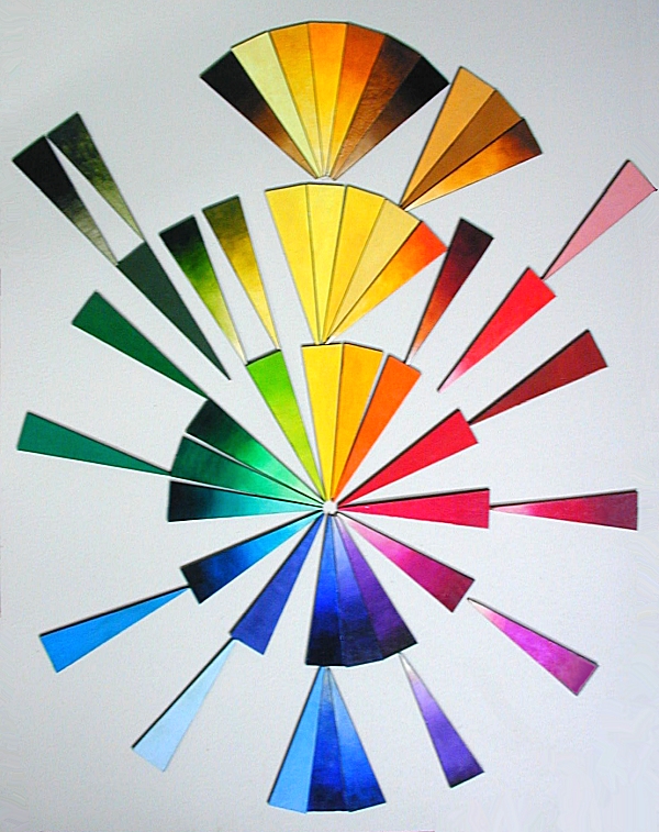
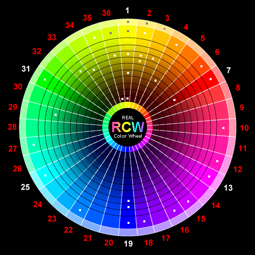
Pigment Map Real Color Wheel
Pigment Map Real Color Wheel
Encyclopedia of Pigments
Info Collected from ( http://en.wikipedia.org/wiki/Pigment )
Pigment
From Wikipedia, the free encyclopedia
- For the drug referred to as "pigment," see black tar heroin.


A pigment is a material that changes the color of light it reflects as the result of selective color absorption. This physical process differs from fluorescence, phosphorescence, and other forms ofluminescence, in which the material itself emits light.
Many materials selectively absorb certain wavelengths of light. Materials that humans have chosen and developed for use as pigments usually have special properties that make them ideal for coloring other materials. A pigment must have a high tinting strength relative to the materials it colors. It must be stable in solid form at ambient temperatures.
For industrial applications, as well as in the arts, permanence and stability are desirable properties. Pigments that are not permanent are called fugitive. Fugitive pigments fade over time, or with exposure to light, while some eventually blacken.
Pigments are used for coloring paint, ink, plastic, fabric, cosmetics, food and other materials. Most pigments used in manufacturing and the visual arts are dry colourants, usually ground into a finepowder. This powder is added to a vehicle (or matrix), a relatively neutral or colorless material that acts as a binder.
The worldwide market for inorganic, organic and special pigments had a total volume of around 7,4 million tons in 2006. Asia has the highest rate on a quantity basis followed by Europe and North America. In 2006, a turnover of 17,6 billion US$ (13 billion Euro) was reached mostly in Europe, followed by North America and Asia.
A distinction is usually made between a pigment, which is insoluble in the vehicle (resulting in a suspension), and a dye, which either is itself a liquid or is soluble in its vehicle (resulting in a solution). The term biological pigment is used for all colored substances independent of their solubility. A colorantcan be both a pigment and a dye depending on the vehicle it is used in. In some cases, a pigment can be manufactured from a dye by precipitating a soluble dye with a metallic salt. The resulting pigment is called a lake pigment.
Contents |
Physical Basis

Pigments appear the colors they are because they selectively reflect and absorb certain wavelengths of light. White light is a roughly equal mixture of the entire visible spectrum of light. When this light encounters a pigment, some wavelengths are absorbed by the chemical bonds and substituents of the pigment, and others are reflected. This new reflected light spectrum creates the appearance of a color.Ultramarine reflects blue light, and absorbs other colors. Pigments, unlike fluorescent orphosphorescent substances, can only subtract wavelengths from the source light, never add new ones.
The appearance of pigments is intimately connected to the color of the source light. Sunlight has a highcolor temperature, and a fairly uniform spectrum, and is considered a standard for white light. Artificial light sources tend to have great peaks in some parts of their spectrum, and deep valleys in others. Viewed under these conditions, pigments will appear different colors.

Color spaces used to represent colors numerically must specify their light source. Lab color measurements, unless otherwise noted, assume that the measurement was taken under a D65 light source, or "Daylight 6500 K", which is roughly the color temperature of sunlight.
Other properties of a color, such as its saturation or lightness, may be determined by the other substances that accompany pigments. Binders and fillers added to pure pigment chemicals also have their own reflection and absorption patterns, which can affect the final spectrum. Likewise, in pigment/binder mixtures, individual rays of light may not encounter pigment molecules, and may be reflected as is. These stray rays of source light contribute to the saturation of the color. Pure pigment allows very little white light to escape, producing a highly saturated color. A small quantity of pigment mixed with a lot of white binder, however, will appear desaturated and pale, due to the high quantity of escaping white light.
Pigment Groups
- Arsenic pigments: Paris Green
- Carbon pigments: Carbon Black, Ivory Black, Vine Black, Lamp Black
- Cadmium pigments: cadmium pigments, Cadmium Green, Cadmium Red, Cadmium Yellow, Cadmium Orange
- Iron oxide pigments: Caput Mortuum, oxide red, Red Ochre, Sanguine, Venetian Red
- Prussian blue
- Chromium pigments: Chrome Green, Chrome Yellow
- Cobalt pigments: Cobalt Blue, Cerulean Blue, Cobalt Violet, Aureolin
- Lead pigments: lead white, Naples yellow, Cremnitz White, red lead
- Copper pigments: Paris Green, Verdigris, Viridian, Egyptian Blue, Han Purple
- Titanium pigments: Titanium White, Titanium Beige, Titanium yellow, Titanium Black
- Ultramarine pigments: Ultramarine, Ultramarine Green Shade, French Ultramarine
- Mercury pigments: Vermilion
- Zinc pigments: Zinc White
- Clay earth pigments (which are also iron oxides): Raw Sienna, Burnt Sienna, Raw Umber, Burnt Umber, Yellow Ochre.
- Biological origins: Alizarin, Alizarin Crimson, Gamboge, Indigo, Indian Yellow, Cochineal Red, Tyrian Purple, Rose madder
- Other Organic: Pigment Red 170, Phthalo Green, Phthalo Blue, Quinacridone Magenta.
Biological Pigments

In biology, a pigment is any colored material of plant or animal cells. Many biological structures, such asskin, eyes, fur and hair contain pigments (such as melanin) in specialized cells called chromatophores. Many conditions affect the levels or nature of pigments in plant, animal, some protista, or fungus cells. For instance, Albinism is a disorder affecting the level of melanin production in animals.
Pigment color differs from structural color in that it is the same for all viewing angles, whereas structural color is the result of selective reflection or iridescence, usually because of multilayer structures. For example, butterfly wings typically contain structural color, although many butterflies have cells that contain pigment as well.
History
Naturally occurring pigments such as ochres and iron oxides have been used as colorants since prehistoric times. Archaeologists have uncovered evidence that early humans used paint for aesthetic purposes such as body decoration. Pigments and paint grinding equipment believed to be between 350,000 and 400,000 years old have been reported in a cave at Twin Rivers, near Lusaka, Zambia.
Before the Industrial Revolution, the range of color available for art and decorative uses was technically limited. Most of the pigments in use were earth and mineral pigments, or pigments of biological origin. Pigments from unusual sources such as botanical materials, animal waste,insects, and mollusks were harvested and traded over long distances. Some colors were costly or impossible to mix with the range of pigments that were available. Blue and purple came to be associated with royalty because of their expense.
Biological pigments were often difficult to acquire, and the details of their production were kept secret by the manufacturers. Tyrian Purple is a pigment made from the mucus of one of several species of Murex snail. Production of Tyrian Purple for use as a fabric dye began as early as 1200 BCE by the Phoenicians, and was continued by the Greeks and Romans until 1453 CE, with the fall of Constantinople.[1] The pigment was expensive and complex to produce, and items colored with it became associated with power and wealth. Greek historian Theopompus, writing in the 4th century BCE, reported that "purple for dyes fetched its weight in silver at Colophon [in Asia Minor]."[2]
Mineral pigments were also traded over long distances. The only way to achieve a deep rich blue was by using a semi-precious stone, lapis lazuli, to produce a pigment known as ultramarine, and the best sources of lapis were remote. Flemish painter Jan Van Eyck, working in the 15th century, did not ordinarily include blue in his paintings. To have one's portrait commissioned and painted with ultramarine blue was considered a great luxury. If a patron wanted blue, they were forced to pay extra. When Van Eyck used lapis, he never blended it with other colors. Instead he applied it in pure form, almost as a decorative glaze.[3] The prohibitive price of lapis lazuli forced artists to seek less expensive replacement pigments, both mineral (azurite, smalt) and biological (indigo).

Spain's conquest of a New World empire in the 16th century introduced new pigments and colors to peoples on both sides of the Atlantic. Carmine, a dye and pigment derived from a parasitic insect found in Central and South America, attained great status and value in Europe. Produced from harvested, dried, and crushed cochineal insects, carmine could be used in fabric dye, body paint, or in its solidlake form, almost any kind of paint or cosmetic.
Natives of Peru had been producing cochineal dyes for textiles since at least 700 CE,[4] but Europeans had never seen the color before. When the Spanish invaded the Aztec empire in what is now Mexico, they were quick to exploit the color for new trade opportunities. Carmine became the region's second most valuable export next to silver. Pigments produced from the cochineal insect gave the Catholiccardinals their vibrant robes and the English "Redcoats" their distinctive uniforms. The true source of the pigment, an insect, was kept secret until the 18th century, when biologists discovered the source.[5]

While Carmine was popular in Europe, blue remained an exclusive color, associated with wealth and status. The 17th century Dutch master Johannes Vermeeroften made lavish use of lapis lazuli, along with Carmine and Indian Yellow, in his vibrant paintings.
Development of Synthetic Pigments
The earliest known pigments were natural minerals. Natural iron oxides give a range of colors and are found in many Paleolithic and Neolithic cave paintings. Two examples include Red Ochre, anhydrous Fe2O3, and the hydrated Yellow Ochre (Fe2O3.H2O).[6] Charcoal, or carbon black, has also been used as a black pigment since prehistoric times.[7]
Two of the first synthetic pigments were white lead (basic lead carbonate, (PbCO3)2Pb(OH)2) and blue frit (Egyptian Blue). White lead is made by combining lead with vinegar (acetic acid, CH3COOH) in the presence of CO2. Blue frit is calcium copper silicate and was made from glass colored with a copper ore, such as malachite. These pigments were used as early as the second millennium BCE.[8]
The Industrial and Scientific Revolutions brought a huge expansion in the range of synthetic pigments, pigments that are manufactured or refined from naturally occurring materials, available both for manufacturing and artistic expression. Because of the expense of Lapis Lazuli, much effort went into finding a less costly blue pigment.
Prussian Blue was the first modern synthetic pigment, discovered by accident in 1704. By the early 19th century, synthetic and metallic blue pigments had been added to the range of blues, including French ultramarine, a synthetic form of lapis lazuli, and the various forms of Cobaltand Cerulean Blue. In the early 20th century, organic chemistry added Phthalo Blue, a synthetic, organic pigment with overwhelming tinting power.
Discoveries in color science created new industries and drove changes in fashion and taste. The discovery in 1856 of mauveine, the firstaniline dye, was a forerunner for the development of hundreds of synthetic dyes and pigments. Mauveine was discovered by an 18-year-old chemist named William Henry Perkin, who went on to exploit his discovery in industry and become wealthy. His success attracted a generation of followers, as young scientists went into organic chemistry to pursue riches. Within a few years, chemists had synthesized a substitute for madder in the production of Alizarin Crimson. By the closing decades of the 19th century, textiles, paints, and other commodities in colors such as red, crimson, blue, and purple had become affordable.[9]

Development of chemical pigments and dyes helped bring new industrial prosperity to Germany and other countries in northern Europe, but it brought dissolution and decline elsewhere. In Spain's former New World empire, the production of cochineal colors employed thousands of low-paid workers. The Spanish monopoly on cochineal production had been worth a fortune until the early 1800s, when theMexican War of Independence and other market changes disrupted production.[10] Organic chemistrydelivered the final blow for the cochineal color industry. When chemists created inexpensive substitutes for carmine, an industry and a way of life went into steep decline.[11]
New sources for historic pigments

Before the Industrial Revolution, many pigments were known by the location where they were produced. Pigments based on minerals and clays often bore the name of the city or region where they were mined. Raw Sienna and Burnt Sienna came from Siena, Italy, while Raw Umber and Burnt Umber came fromUmbria. These pigments were among the easiest to synthesize, and chemists created modern colors based on the originals that were more consistent than colors mined from the original ore bodies. But the place names remained.
Historically and culturally, many famous natural pigments have been replaced with synthetic pigments, while retaining historic names. In some cases the original color name has shifted in meaning, as a historic name has been applied to a popular modern color. By convention, a contemporary mixture of pigments that replaces a historical pigment is indicated by calling the resulting color a hue, but manufacturers are not always careful in maintaining this distinction. The following examples illustrate the shifting nature of historic pigment names:

- Indian Yellow was once produced by collecting the urine of cattle that had been fed only mango leaves. Dutch and Flemish painters of the 17th and 18th centuries favored it for its luminescent qualities, and often used it to represent sunlight. In Girl with a Pearl Earring, Vermeer's patron remarks that Vermeer used "cow piss" to paint his wife. Since mango leaves are nutritionally inadequate for cattle, the practice of harvesting Indian Yellow was eventually declared to be inhumane. Modern Indian Yellow Hue is a mixture of synthetic pigments.
- Ultramarine, originally the semi-precious stone lapis lazuli, has been replaced by an inexpensive modern synthetic pigment manufactured from aluminium silicate with sulfur impurities. At the same time, Royal Blue, another name once given to tints produced from lapis lazuli, has evolved to signify a much lighter and brighter color, and is usually mixed from Phthalo Blue and titanium dioxide, or from inexpensive synthetic blue dyes. Since synthetic ultramarine is chemically identical with lapis lazuli, the "hue" designation is not used. French Blue, yet another historic name for ultramarine, was adopted by the textile and apparel industry as a color name in the 1990s, and was applied to a shade of blue that has nothing in common with the historic pigment French ultramarine.
- Vermilion, a toxic mercury compound favored for its deep red-orange color by old master painters such as Titian, has been replaced by convenient mixtures of synthetic, inorganic pigments. Although genuine Vermilion paint can still be purchased for fine arts and art conservation applications, few manufacturers make it, because of legal liability issues. Few artists buy it, because it has been superseded by modern pigments that are both less expensive and less toxic, as well as less reactive with other pigments. As a result, genuine Vermilion is almost unavailable. Modern vermilion colors are properly designated as Vermilion Hue to distinguish them from genuine Vermilion.
Manufacturing and Industrial Standards

Before the development of synthetic pigments, and the refinement of techniques for extracting mineral pigments, batches of color were often inconsistent. With the development of a modern color industry, manufacturers and professionals have cooperated to create international standards for identifying, producing, measuring, and testing colors.
First published in 1905, the Munsell Color System became the foundation for a series of color models, providing objective methods for the measurement of color. The Munsell system describes a color in three dimensions, hue, value (lightness), and chroma (color purity), where chroma is the difference from gray at a given hue and value.
By the middle years of the 20th century, standardized methods for pigment chemistry were available, part of an international movement to create such standards in industry. TheInternational Organization for Standardization (ISO) develops technical standards for the manufacture of pigments and dyes. ISO standards define various industrial and chemical properties, and how to test for them. The principal ISO standards that relate to all pigments are as follows:
- ISO-787 General methods of test for pigments and extenders
- ISO-8780 Methods of dispersion for assessment of dispersion characteristics
Other ISO standards pertain to particular classes or categories of pigments, based on their chemical composition, such as ultramarinepigments, titanium dioxide, iron oxide pigments, and so forth.
Many manufacturers of paints, inks, textiles, plastics, and colors have voluntarily adopted the Colour Index International (CII) as a standard for identifying the pigments that they use in manufacturing particular colors. First published in 1925, and now published jointly on the web by theSociety of Dyers and Colourists (United Kingdom) and the American Association of Textile Chemists and Colorists (USA), this index is recognized internationally as the authoritative reference on colorants. It encompasses more than 27,000 products under more than 13,000 generic color index names.
In the CII schema, each pigment has a generic index number that identifies it chemically, regardless of proprietary and historic names. For example, Phthalo Blue has been known by a variety of generic and proprietary names since its discovery in the 1930s. In much of Europe, phthalocyanine blue is better known as Helio Blue, or by a proprietary name such as Winsor Blue. An American paint manufacturer, Grumbacher, registered an alternate spelling (Thalo Blue) as a trademark. Colour Index International resolves all these conflicting historic, generic, and proprietary names so that manufacturers and consumers can identify the pigment (or dye) used in a particular color product. In the CII, all Phthalo Blue pigments are designated by a generic colour index number as either PB15 or PB16, short for pigment blue 15 and pigment blue 16. (The two forms of Phthalo Blue, PB15 and PB16, reflect slight variations in molecular structure that produce a slightly more greenish or reddish blue.)
Scientific and Technical Issues
Selection of a pigment for a particular application is determined by cost, and by the physical properties and attributes of the pigment itself. For example, a pigment that is used to color glass must have very high heat stability in order to survive the manufacturing process; but, suspended in the glass vehicle, its resistance to alkali or acidic materials is not an issue. In artistic paint, heat stability is less important, whilelightfastness and toxicity are greater concerns.
The following are some of the attributes of pigments that determine their suitability for particular manufacturing processes and applications:
- Lightfastness
- Heat stability
- Toxicity
- Tinting strength
- Staining
- Dispersion
- Opacity or transparency
- Resistance to alkalis and acids
- Reactions and interactions between pigments
Swatches
Pure pigments reflect light in a very specific way that cannot be precisely duplicated by the discrete light emitters in a computer display. However, by making careful measurements of pigments, close approximations can be made. The Munsell Color System provides a good conceptual explanation of what is missing. Munsell devised a system that provides an objective measure of color in three dimensions: hue, value (or lightness), and chroma. Computer displays in general are unable to show the true chroma of many pigments, but the hue and lightness can be reproduced with relative accuracy. However, when the gamma of a computer display deviates from the reference value, the hue is also systematically biased.
The following approximations assume a display device at gamma 2.2, using the sRGB color space. The further a display device deviates from these standards, the less accurate these swatches will be.[12] Swatches are based on the average measurements of several lots of single-pigment watercolor paints, converted from Lab color space to sRGB color space for viewing on a computer display. Different brands and lots of the same pigment may vary in color. Furthermore, pigments have inherently complex reflectance spectra that will render their color appearance greatly different depending on the spectrum of the source illumination; a property called metamerism. Averaged measurements of pigment samples will only yield approximations of their true appearance under a specific source of illumination. Computer display systems use a technique called chromatic adaptation transforms[13] to emulate the correlated color temperature of illumination sources, and cannot perfectly reproduce the intricate spectral combinations originally seen. In many cases the perceived color of a pigment falls outside of thegamut of computer displays and a method called gamut mapping is used to approximate the true appearance. Gamut mapping trades off any one of Lightness, Hue or Saturation accuracy to render the color on screen, depending on the priority chosen in the conversion's ICC rendering intent.
#990024 | PR106 - #E34234 Vermilion (genuine) | #FFB02E Indian Yellow |
|---|
PB29 - #003BAF Ultramarine Blue | PB27 - #0B3E66 Prussian Blue |
|---|